The biggest movie poster fails of 2018

Movie studios, do not skimp on your marketing budget.
You can have the greatest, funniest, Oscar-worthiest movie ever made, but if your movie poster looks like it was made by a design intern with a hangover then you’re staring down the barrel of a flop.
These 10 one-sheets represent the worst movie posters that 2018 had to offer – the kind of badly designed, gaudy monstrosities that make walls want to fall down.
Jurassic World: Fallen Kingdom

As much as we’d love a Jurassic World movie that didn’t feature any humans, it’s not going to happen any time soon, but this bizarre mash-up poster suggests an alternate timeline where the dinosaurs really are the stars of the show.
The scaling (no pun intended) is exceedingly odd, and the placement of the actual park in mid-air above the hovering cluster of dinosaurs is a very strange design choice indeed. Still, it does what it says on the tin: if you asked anyone who saw this poster what they thought this movie was about, they’d tick the two boxes marked ‘DINOSAURS’ and ‘VOLCANOES’.
Speed Kills
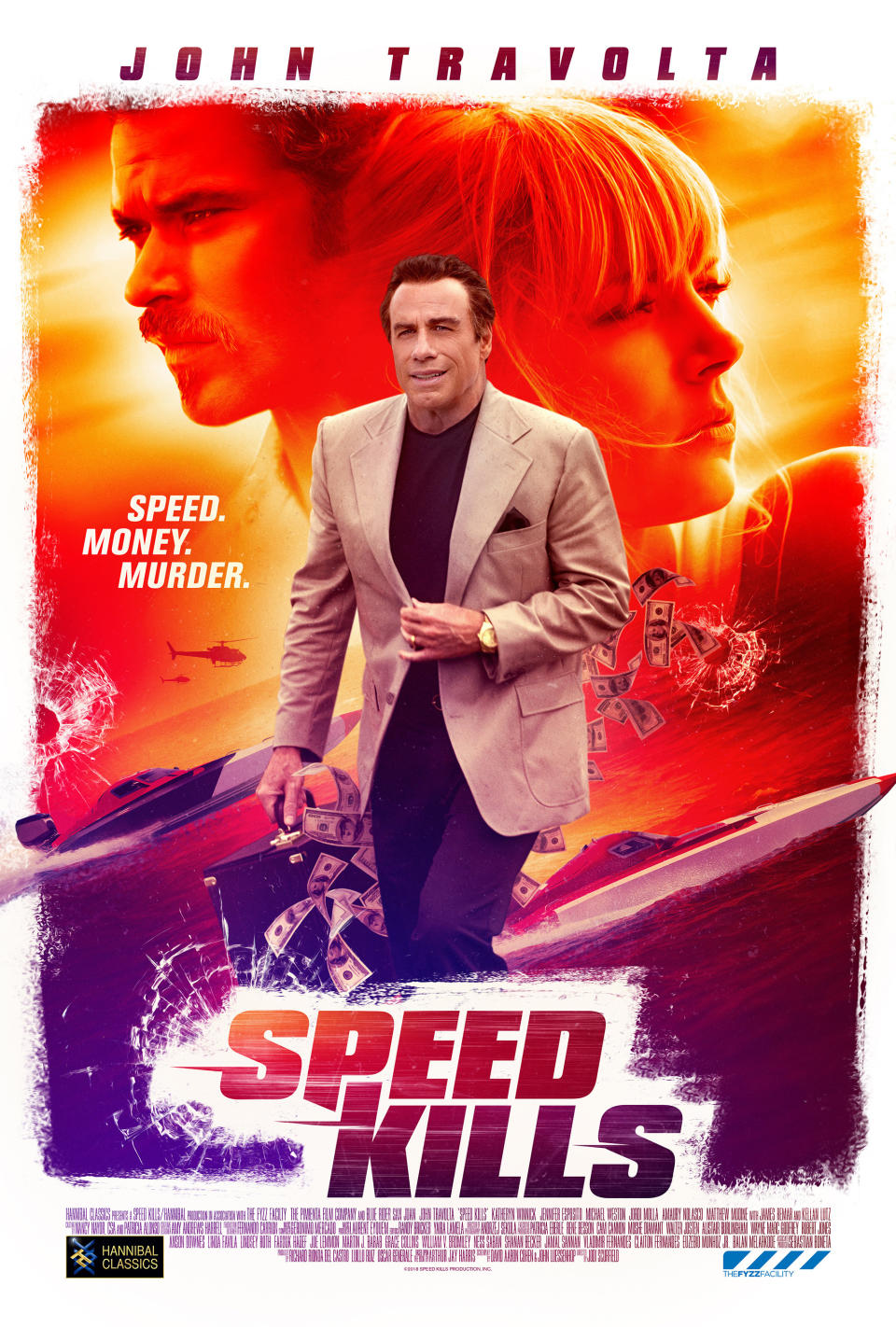
A fun game when looking at actors posing on movie posters is to imagine what directions the cameraman was yelling at them during the shoot. It’d usually be something like “Pout!” or “Squint!” or “Be sexier!” but in the case of this little-seen speedboat thriller, we can imagine John Travolta was told “You’re waiting for the toilet and your bladder is full! No, full! Fuller!”
If you can shift focus away from Travolta doing the need-a-wee walk, you may also notice the random helicopter and bullet holes, sure-fire signs that this movie is definitely amazing and not an assorted collection of tough guy clichés.
Aquaman
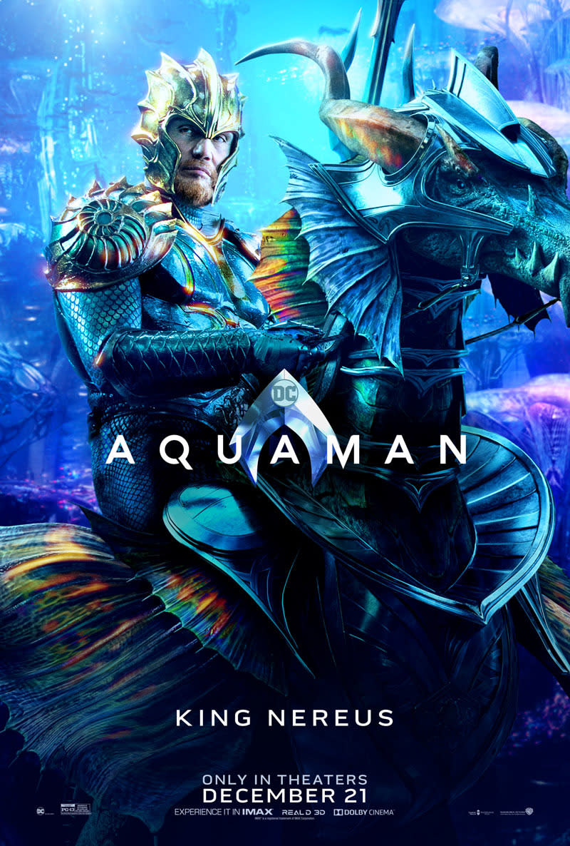
There’s not an actor in the world that can pull off the ‘armour-plated underwater king riding a rainbow seahorse’ look without looking a little bit silly – Warner Bros had to hire Dolph Lundgren for the role in the hope his intense stare would counter-balance the camp.
In truth, all of the Aquaman posters have been terrible and have the horrible, flat look of novelty photobooths at aquariums that make it look like you’re underwater. Still, we’re not about to tell Dolph he looks like a water pixie. Be our guest.
Holmes & Watson
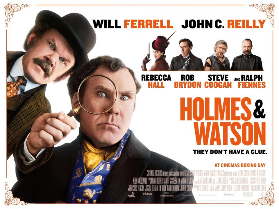
Okay, so. Hear me out. Maybe, just maybe, if Sherlock Holmes is the world’s greatest detective… wouldn’t he have figured out that there is no lens in Dr Watson’s magnifying glass?
Is that… is that supposed to be the actual joke? It’s quite hard to tell if it’s an intentional joke. Most of the trailers for this movie seem to be relying on the comedic premise of ‘Will Ferrell and John C Reilly… but in the past!’ i.e. just sort of having them standing around in old-timey clothes seems to be about the size of it. So is the magnifying glass thing a joke or not? It’s a mystery worthy of… well.
Bumblebee

Why is Bumblebee sitting on a toilet?
Venom

First thoughts: it’s a bit busy, isn’t it? Lots, as they say, to unpack. Although it’s an improvement on the ‘big face’ poster, with Tom Hardy doing 50% catalogue model pose and 50% ‘Help I’m being consumed by an alien symbiote’, this one sheet feels like someone was told to fit the entire movie on the poster.
‘It absolutely must feature Venom, Tom Hardy, Riz Ahmed, Michelle Williams, also a bridge, a spaceship, some police cars in the woods, a helicopter drone thing and a big black V daubed over the top, and if there’s any room left after that you can fill it with indecipherable black squiggly things’. See? It’s easy being a designer.
King of Thieves
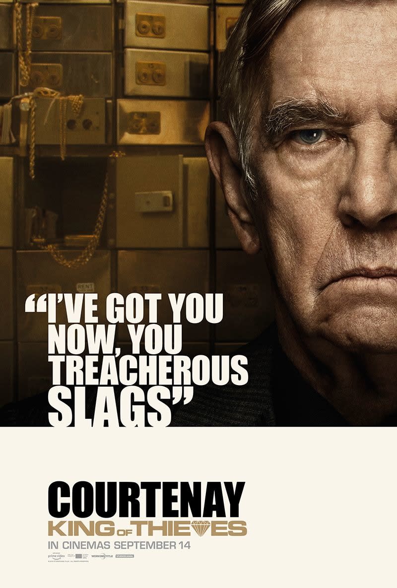
“I’ve got you now, you treacherous slags.” Not the best, funniest or smartest line from 2018, but certainly the largest, thanks to this King of Thieves character poster, featuring Tom Courtenay next to his most memorable line of dialogue.
Are there better ways to sell this movie? Yes. It’s a British gangster movie about a diamond heist starring Michael Caine! However, focusing on those things would mean you wouldn’t get to have a picture of Tom Courtenay next to the word ‘SLAGS’ in giant white lettering, so fair play.
Bad Times at the El Royale
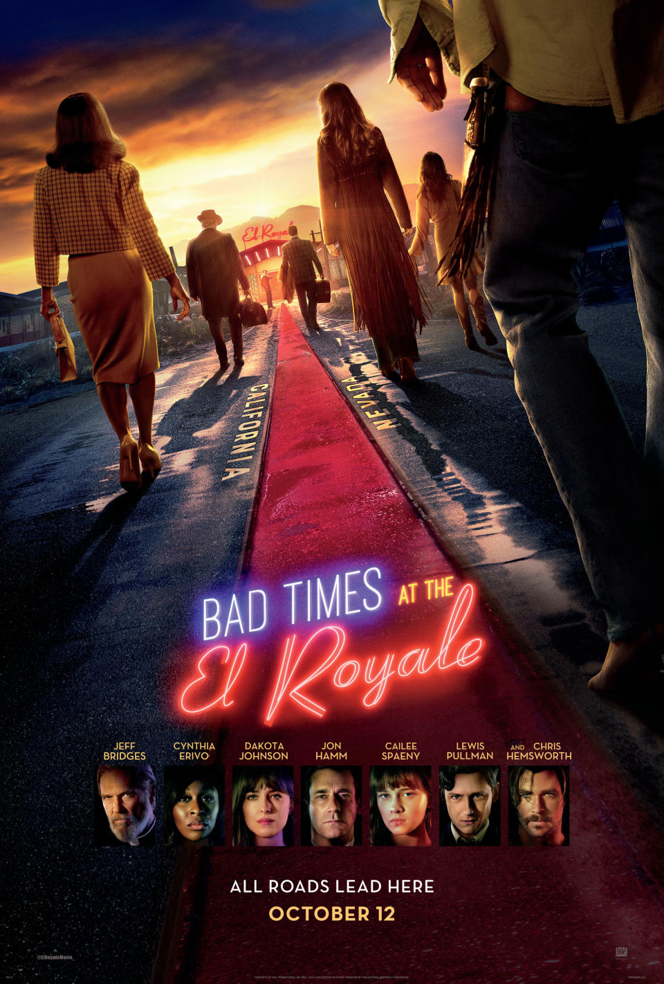
Have you ever seen a movie poster panic? Here we have an ominous teaser poster for the Drew Goddard thriller, featuring an all-star cast – including A-listers like Chris Hemsworth, Jeff Bridges and Jon Hamm – lined up with their backs to the camera. Ooh, bold! I like it. It says ‘This movie is so cool, you don’t even need to see the cast’s faces!’
That is, until you get to the bottom of the poster, where it chickens out and starts hyperventilating because you can’t see any of the cast’s faces, oh god why did we spend so much money on casting, so you get a little row of last-minute head-shots just in case you can’t read.
The Happytime Murders
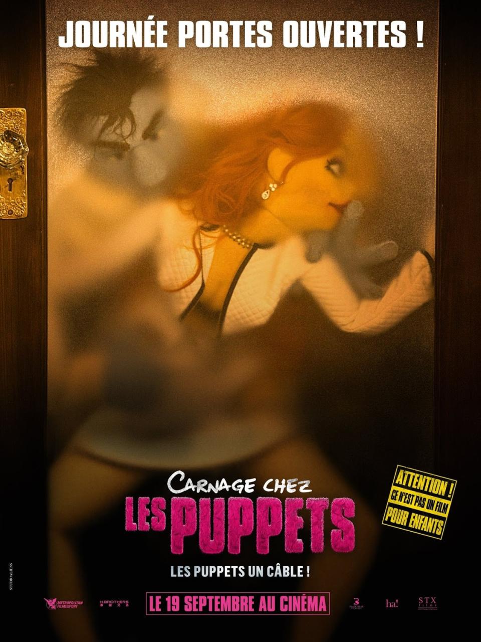
‘Attention!’ reads the notice on this French poster for the off-brand Muppets black comedy, ‘This is not a movie for children!’ Judging from the smoking crater in the box-office where money should have been, it was not a movie for anyone, and this poster might offer a clue as to why.
Yes, the concept of a Muppet movie for adults is fun, but nobody’s kink is watching two fuzzy felt characters going at it against frosted glass. That’d be like taking crack in a Sesame Street back-alley or watching Elmo fritter away his dole money in the bookies. Some things should just be for children and that’s okay. Pass the mind bleach.
The Equalizer 2
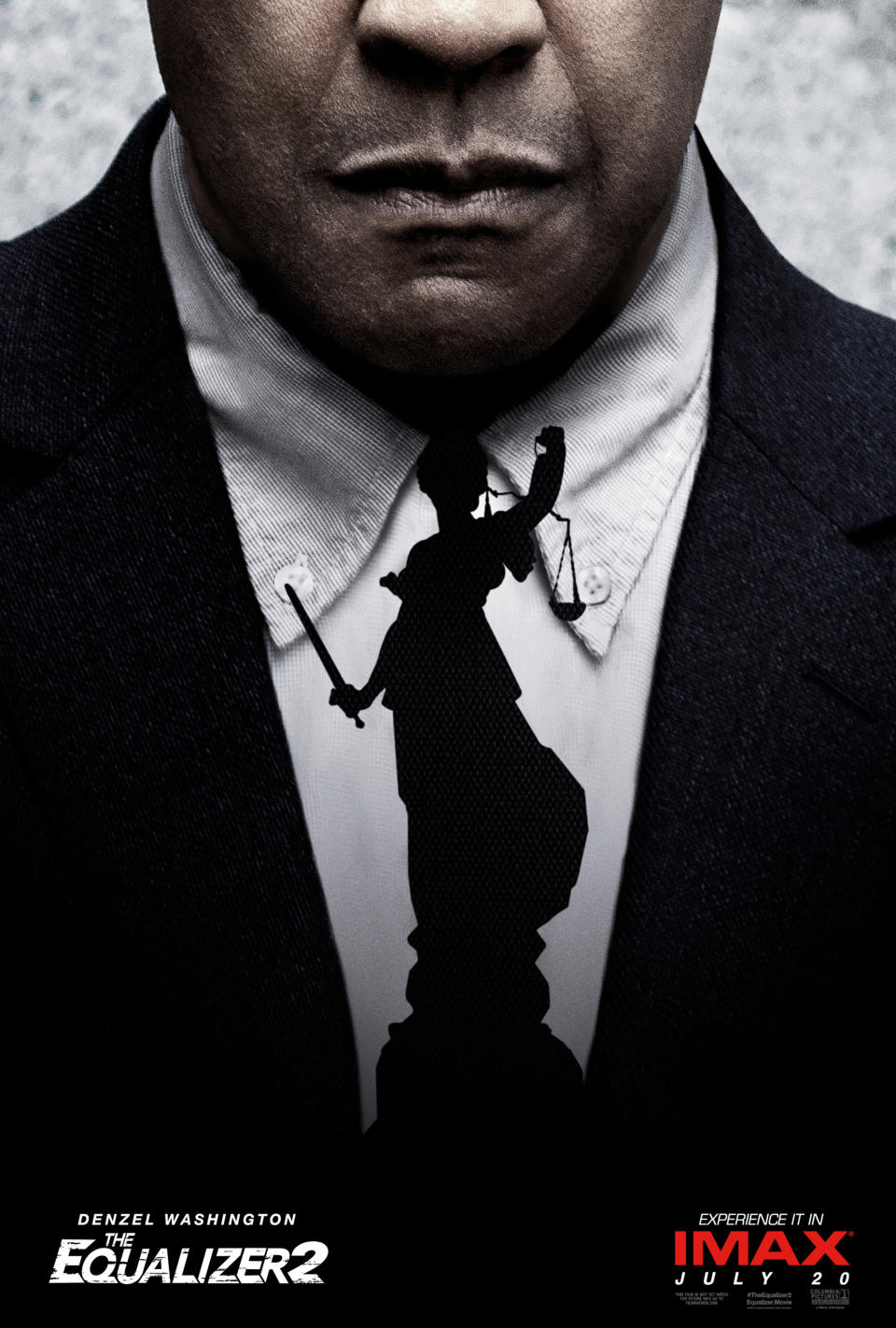
The poster for Denzel Washington’s first ever sequel called for some big ideas. Big ideas like… he’s wearing a tie that’s also… justice? That’s it. That’s literally it. Denzel Washington’s tie – and come to think of it, I’m not sure he even wears a tie in this movie, like, the tie is definitely not even an integral part of the character’s look, let alone the movie as a whole – is also a silhouette of Lady Justice.
This is one of those design concepts that absolutely sounded like a goer at 1 am when it was scribbled on a napkin in a bar, but the cold light of day reveals it to be a complete duffer.
READ MORE
Best Netflix Original films of 2018
Worst movie plot holes of 2018
The stars we lost in 2018

 Yahoo Movies
