Biggest movie poster fails of 2019
2019 has been an another amazing year at the cinema, with box office records being broken left, right and centre by films with incredibly beautiful posters that wouldn’t look out of place in an art gallery.
However, not all posters are created equally, as these pieces of marketing proved.
May these hideous posters never darken the walls of another cinema...
Avengers: Endgame

The only poster fail the Western marketing for Avengers: Endgame achieved was accidentally leaving Danai Gurira's name off the US one-sheet - otherwise, the most successful movie of all time had a flawless showing in the States.
Read more: The most exciting movies coming in 2020
Leave it to these Chinese posters – created for a fan event – then, to make the Avengers look like part-time cosplayers, with a series of rear-view character poses designed to highlight the male superheroes' ass...ets. Hawkeye isn't exactly the most recognisable hero from the front, let alone from the back. Notice also that the designer here clearly hasn't seen the movie, as nowhere in Endgame does the character wear purple, and he's missing his awful 'your mum's new boyfriend' cool guy haircut.
Poms
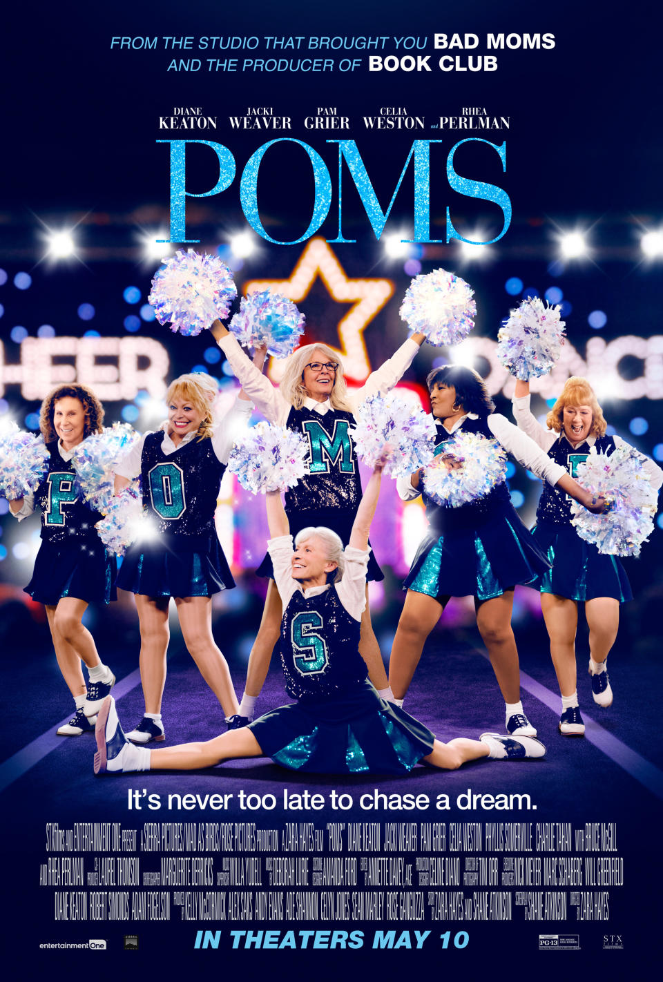
See if you can guess what the movie Poms is about just by looking at the poster for the movie, Poms. Yes, that pretty much covers it: a group of older ladies find new zeal in later life by joining a cheer squad - this poster is nothing if not accurate. But we have questions.
Why do the cast - who have a combined age of over 400 - have the shiny, smooth legs of a bunch of teenage girls? Why is Diane Keaton, the largest of the Poms, treading on the feet of her colleagues? And what is the deal with the letters on the shirts only spelling the name of the movie if you overlook the fact that the two additional letters are obscured? Maybe there's more depth to this movie than we thought? Or maybe the poster just sucks.
Cats

It's the movie extravaganza no one asked for based on the musical sensation no one will admit to liking – and the poster for Cats is just as gaudy and overblown as you'd imagine. Even looking past the creepy 'digital fur technology', which makes stars like Taylor Swift and Idris Elba look like furry deviants, this poster is a bit of a mess: garish, geographically suspect and bizarrely composited.
The movie has already attracted ridicule for an apparent inconsistency in the physical size of the cats in relation to the world they live in, and this poster doesn't exactly help matters. Please, James Corden covered in fur is scary enough – don't make us imagine him being a giant too.
Sonic The Hedgehog
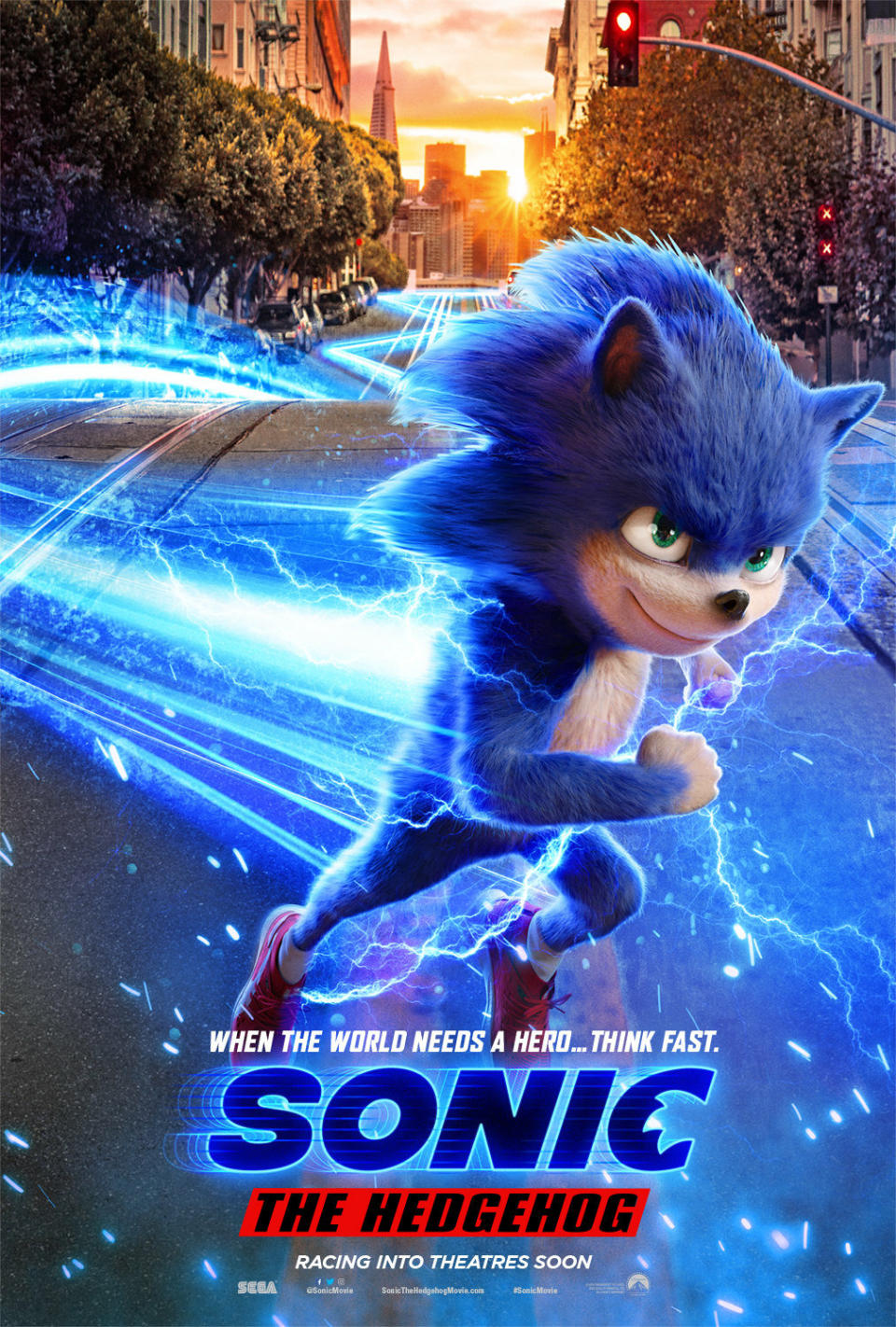
To be fair, you can't blame the poster for this one – this represents a fail at a conceptual level. The mistake the designers made was to feature the movie's main character in full on the poster. Unforgivable!
Read more: New Sonic trailer reveals character redesign
Every atom of this iteration of Sonic feels like an abomination, like a crime against movies – the face fur, the separated eyes, the long legs, the knees... What is it with 2019 and weird fur-covered humanoid creatures? Videogame movies usually elicit a raised eyebrow or a mild groan. They are not supposed to make you shudder like someone has stepped on your grave. The redesigned Sonic, revealed in the new trailer, is much more palatable.
Rambo: Last Blood
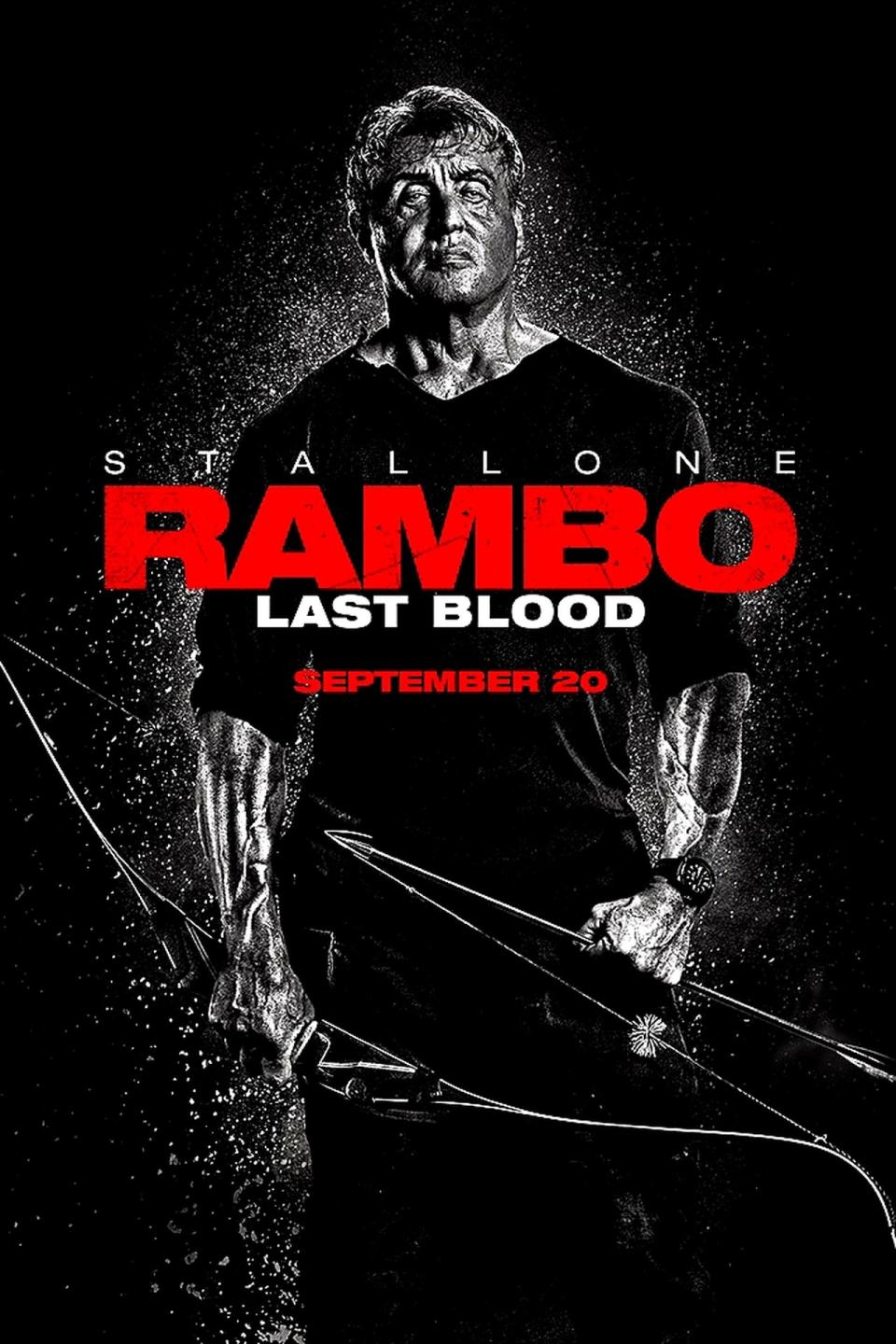
2008's Rambo cemented Sylvester Stallone's career comeback with an ultra-gory meditation on war, violence and man's inhumanity to his fellow man. Eleven years later, Stallone finally shed Last Blood, a lunkheaded Rambo movie at least a decade out of time, preaching the message 'Hurr, guns are cool'.
The poster uses a chromatic palette in an attempt to inject some class into Stallone's bulging veins, but the result makes Sly look like a bloated metal corpse of his former self, a sort of steroid-abusing off-brand Terminator who looks desperate to be put out of his misery. Pray for Rambot.
Spider-Man: Far From Home

The Tom Holland Spidey movies are fun, action-packed and visually thrilling. Why, then, does the Peter Parker cardboard cut-out on this poster look like he's more concerned with the results of a trigonometry exam than the threat of dangerous, other-wordly elemental creatures?
Read more: Spider-Man is one of the 'motherf***ing pornstars' of the MCU
Between them, Holland, Sam Jackson and Jake Gyllenhaal suffer from an excess of personality and character - but this flat poster has them pulling 'school photo day' poses like their parents are watching. I mean, guh, at least chuck some unnecessary helicopters or Quinjets in the sky above them. It's like they're not even aiming for average.
No Time To Die
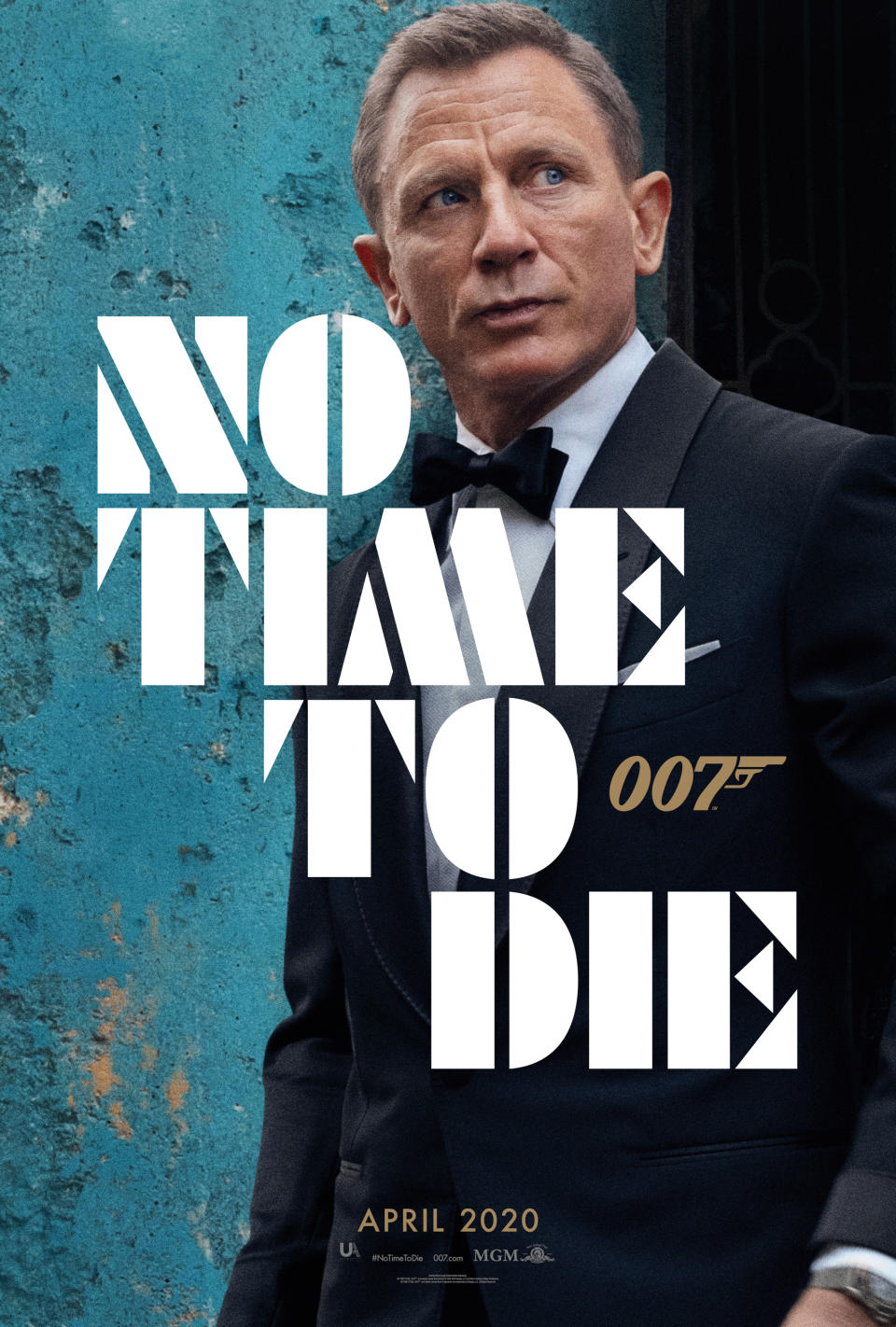
Okay, it's just a teaser poster, but the Bond franchise should aspire to meet certain standards of slickness and style. Daniel Craig isn't projecting privileged panache or silent menace or even seething rage here - instead, the sour-faced bruiser looks like he's getting progressively more annoyed waiting for a late cab to turn up.
Read more: No Time To Die character posters
Can't you read? He's got no time to die, let alone catch the bus! This poster also loses points for pointlessly smuggling in a blurry shot of Bond's watch, a contractual obligation peeking out from beneath his permanently-two-inches-too-short suit sleeve.
Long Shot
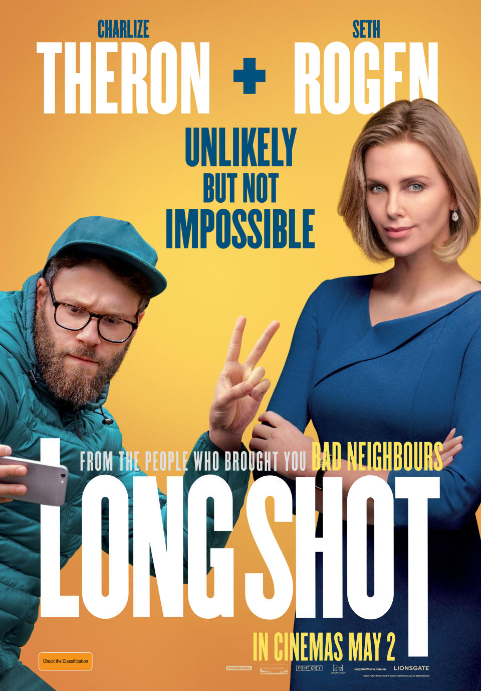
It's a special skill to make Charlize Theron look unattractive – people have literally won Oscars for it. There will be no silverware for this instance of Theronicide, however – this Long Shot poster features a good old-fashioned Photoshop-assisted facial fail.
Read more: The best horror films of the year
You can see all ten seconds of the designer's thought process etched on the face of Theron's politician character, who has had the pixels of her serious facial expression pulled painfully into a smile. She's more monster than Monster; this poster makes Seth Rogen look like the attractive one.
Dolittle

Question marks hang over Dolittle thanks to release date delays, extensive reshoots handled by different directors, a trailer where Downey Jr's voice is seldom heard (due to his attempt at a Welsh accent) and a series of cringeworthy posters of RDJ 'interacting' with all manner of sassy CG animals.
This looks more like a sequel to a Kevin James movie than a suitable vehicle for the biggest star of the Marvel Cinematic Universe - if this poster represents the direction Robert Downey Jr's post-Avengers career is headed, don't be surprised if Iron Man magically finds a way to come back to life pretty soon.
The Gentlemen

Guy Ritchie’s brand of Lock Stock-style macho movies are generally a thing of the past. Nonetheless, he’s just directed a billion dollar blockbuster for Disney. He’s earned a second chance to make his name on a movie poster mean something.
His new movie, The Gentlemen, appears to be a macho Lock Stock-style throwback. As is this poster, which features an assortment of different stars – none of whom look like they were photographed in the same continent, let alone the same room – standing around in a cut-price GQ photoshoot. Guy Ritchie, you are back where you started.

 Yahoo Movies
